The bitcoin chart looks tired. Price has been shoved back from the 80K wall more than once this year, print volume on the daily is thinning out, and the loudest voices on the tape are drifting toward calling the next leg down. That is roughly the frame most retail traders happen to sit in around this range, and it tends to be the frame that turns out wrong at the exact points where a range like this one is about to resolve upward. The reflex at moments like this is to fade the bounce and press the short into the same wall that just rejected. That reflex has fed the previous few rounds of chop against the 80K wall, and it may be about to feed one more.
There is a different way to read the same range and the same wall. The stall against 80K may not be a top forming at all, it may be a ceiling that has already done most of its work absorbing liquidity from both sides of the book. If that reading of the wall holds, the current chop is not a bear market in miniature, it is the last box before a resolution higher above the wall. That interpretation is a much less popular view around this range right now, which is roughly one of the reasons the wall deserves a slower look.
Chop is not a bear market
Chop like this one is usually described as boredom, and boredom inside a range tends to feel bearish to anyone who joined during a rally. Momentum stops paying, participation drops off, and the calmer voices get drowned out by the loudest fade. The volume dry-up during that chop often gets read as distribution, but it is often the opposite of distribution. When neither side has real confidence in the next big move, participation simply sits out, and turnover contracts by default. That contraction is what a range typically does before a resolution, not what it typically does at a real top on the way to distribution.
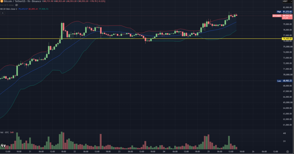
The setup on screen sits directly inside that same coiled range. Price has been coiled between roughly 74K and 80K for weeks, spent time above the mid-band on lower timeframes, and posted a clean retest around 76.5K where the shorter-frame structure looks a lot more like a double bottom than a breakdown of the coiled shape. The retest does not guarantee an upside break by itself. It does remove the obvious “this is already falling” reading of the coiled range, though, which is the reading most short-side positioning has to lean on. What is on screen is a coiled range with a firm floor near the retest low, and the volume signature inside that coil is not a distribution signature.
Why the 80K wall keeps holding
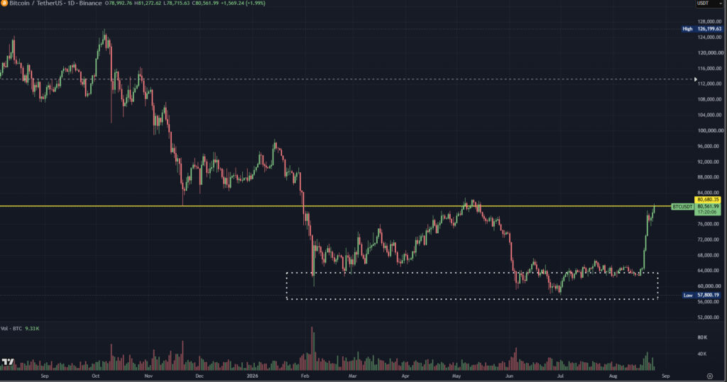
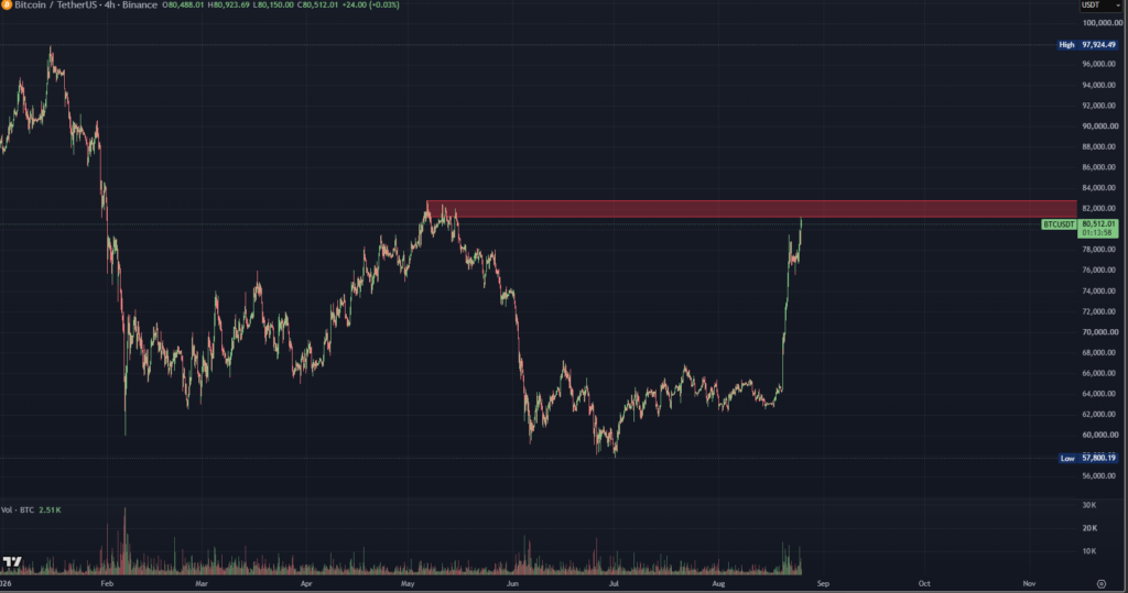
The wall at 80K is not a random ceiling. The ceiling sits directly on top of the November low pocket from last year and the failed breakout region from May, which is roughly why price kept getting rejected there on the first, second, and third attempts. Two independent frameworks land on the same ceiling. Horizontal price memory calls it a battleground zone, and order-flow tooling puts a visible sell block in roughly the same neighborhood on the 4-hour view.
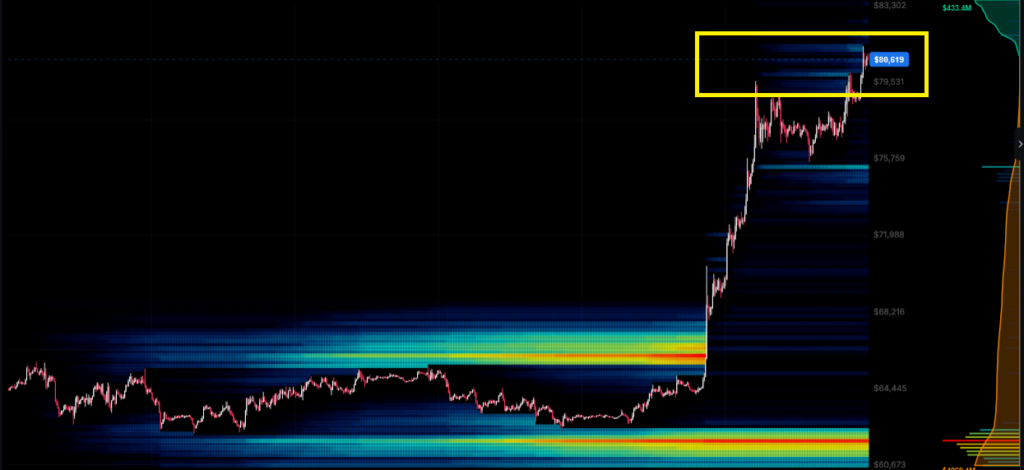
That confluence of price memory and order-flow structure at the ceiling is a lot of why the ceiling has held even as spot climbed off the last major low. Buyers who need to fill above the ceiling have not yet been forced to lift the offers stacked there, and sellers who want to defend the ceiling have not yet been forced to give up their stack. The stalemate between those buyers and sellers is what shows up on the chart as a flat ceiling, and a flat ceiling will keep looking bearish until the moment it stops looking bearish. That is roughly the trick of ceilings that are about to break, they generally look identical to ceilings that are about to hold, right up until they do not.
The three-market sweep sitting under the tape
The more interesting piece of that ceiling story is what the sequence has already done to prepare the book for a break. Over the last several months, the tape traced a fairly clean four-part sequence. A floor around 60K held on retest, offers around 77 to 80K kept capping the upside, a sharp move through the offer stack ran the short stops, and a later flush through the range low ran the long stops. Both sides of the book have been swept in that sequence. The sweep leaves the same offer stack relatively clean of the trapped positioning that would otherwise fuel another rejection.
Cumulative delta on futures reinforces that same sweep story. The delta signature around the swept offer stack shows an accumulation of sell interest concentrated in a fairly narrow band, which is roughly what a defended offer stack looks like right before someone with size decides to take those offers instead of joining them. Whether the take happens this week or next month is not really the point. The point is that the delta structure now sitting under the offer stack looks a lot more like a coiled setup than a topping pattern at the same offer.
The dominance shelf that gates the next leg
Price alone rarely tells the whole story, and the sweep read is no exception to that rule. Stablecoin dominance sits underneath the market as a proxy for how much dry powder is parked in cash and how eager holders are to redeploy that cash into risk. The dominance shelf on that particular chart lives roughly between 6.4 and 7.4 percent, and dominance behavior around this shelf has been a hinge point for essentially every major trend change since the 2022 low. The 2022 to 2023 chop found its floor at the dominance shelf. The 2024 breakout that kicked off the last leg higher was accompanied by a decisive exit from the same dominance shelf. Every meaningful pullback since then has bottomed against the same dominance zone before turning back up.
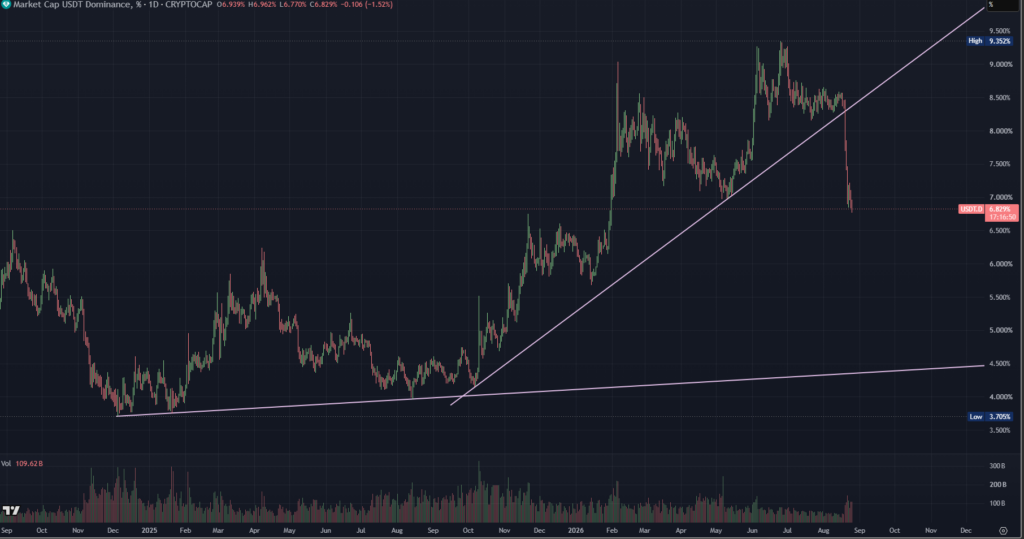
Dominance sits back at that same shelf again right now. The behavior of dominance around this shelf typically matters more than the exact reading in either direction. When dominance loses the shelf from above, it tends to signal that cash is being converted into risk, and that flow is roughly the ambient condition the market needs to run the next leg. When dominance holds the shelf from below and turns back up, the opposite tends to happen and risk assets tend to stall. The dominance piece is what the price chart alone cannot show, and dominance is arguably worth watching more closely than the tick-by-tick fight inside the offer stack.
What breaks the setup and what does not
None of this is a promise. Setups fail when their anchor level gives way, and the anchor here is not really the offer stack itself, it is roughly 70K. A clean loss of 70K would take out the neckline of the recovery structure that has been building since the summer low, and the constructive read of the coiled tape would have to go back on the shelf for a while. Above that anchor, though, price has already respected support near the 0.236 retracement, with the 0.382 line remaining as the maximum allowable drawdown level rather than a full retracement into the recovery neckline itself.
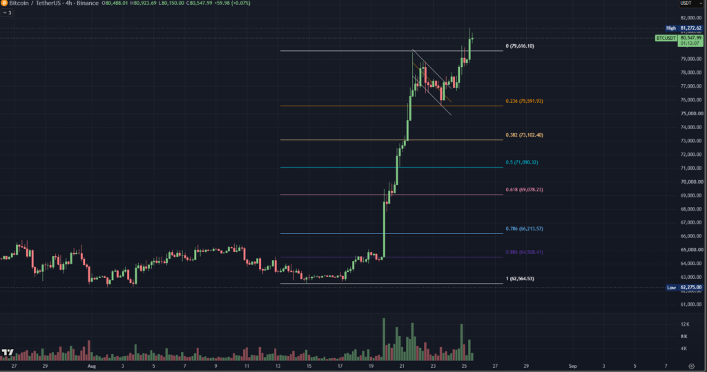
The trickier point around this recovery setup is behavioral rather than technical. Recovery continuations tend to look most attractive to short sellers exactly when they should not, because the recovery has already run enough for a fade to feel like value. When the crowd is already positioned for another leg down, and the structure under the recovery has already cleared the book on both sides, the risk to reward on that fade quietly deteriorates. Interesting trades on tapes like this recovery tape often turn out to be boring ones. Waiting for the dominance shelf to give from above. Waiting for the offer stack to lift on real flow. Treating any dip inside the recovery as a place to think about longs rather than a green light to press the same reflex short into another retest of the same offer.
Whether or not the resolution actually arrives in the near term, the framing worth carrying from this whole picture is that a stall near a level is not automatically a top. Sometimes it is a top, and sometimes it is the quiet portion of a setup that only makes obvious sense in hindsight after the level breaks. Right now, and with the two-sided sweep already visible under the surface, the second reading of the picture is roughly the one that fits the available evidence better than the reflex short reading does.
Data & Sources
Price action drawn from public spot and perpetual futures charts on major venues. Cumulative delta and smart-money style order-block visualizations pulled from public charting platforms across the lower and mid timeframes. Stablecoin dominance shelf reference taken from aggregate crypto market cap trackers over the multi-year view. Retracement bands and channel projections drawn from the recent recovery leg off the summer low. Read as an interpretive overlay of publicly visible market structure, not as a forecast.